Tinting and Toning: A Tone Alone Leaves the Highlights Clear
Frame card
In one line Per Kodak's 1918 handbook, tinting dyes the gelatin, so the whole frame, highlights included, carries a veil of color. Toning replaces the silver image with a colored compound, so the shadows take the color and the highlights stay clear.
Source, Year, Format, Length or Size, Access, License
- Source
- Eastman Kodak Company, Tinting and Toning of Eastman Positive Motion Picture Film, second edition, revised
- Year
- 1918 (preface dated August 1918)
- Format
- Handbook with three sheets of mounted film samples: tints, tones, and tinted and toned
- Length or Size
- 12 sample tints from 6 standard dyes; 14 tones lettered A to N; 7 tone-and-tint pairs
- Access
- Full text and scans of the sample sheets at Project Gutenberg
- License
- Public domain in the US (published 1918) and in the EU (published 1918 under the company name with no author named; 70 years from publication)
Card data (CSV) tinting-and-toning-frame-card.csv Source and license notes
Entry fields
- Name
- Tinting (dyeing the gelatin of a positive print) and toning (replacing its silver image with a colored compound); often used together
- Date range and evidence
- Kodak called color by toning, tinting or both 'becoming more common' in 1918
- Size or running time
- Whole lengths of positive film, worked in tanks on racks or on small drums
- Process or material
- Tint: an acid dye colors the gelatin. Tone: the silver image is wholly or partly replaced by a colored compound or a mordanted dye
- How to recognize it
- Tinted: the clear parts and highlights carry the color. Toned: highlights clear, shadows colored. Both: highlights take the tint color
- Often confused with
- Local tinting by brush or stencil, which Kodak treats separately; machine colorization of a digital copy
- Where to see one
- Kodak 1918 sample sheets (Tints 1 to 12, Tones A to N); Kodak sample 53, Double Tone Auramine, from a sample page not in the 1918 edition
Card data (CSV) tinting-and-toning-entry.csv Source and license notes
Shot list · 4 sections
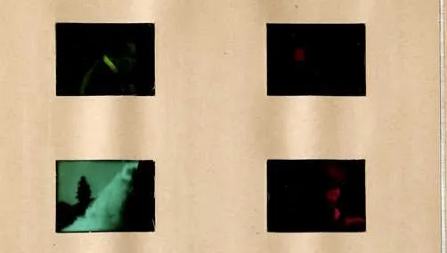
Rows 1 and 2, back of the Tints sheet (Kodak 1918, as scanned; columns mirrored from the numbered side): sample 8, left in row 2, is green to its edges; samples 7, 1 and 2 read almost black.
“Tints sample sheet, back of the leaf, rows 1 and 2, from Tinting and Toning of Eastman Positive Motion Picture Film, second edition (1918)” — Eastman Kodak Company — public domain full credit
"Tints sample sheet, back of the leaf, rows 1 and 2, from Tinting and Toning of Eastman Positive Motion Picture Film, second edition (1918)" by Eastman Kodak Company — https://www.gutenberg.org/ebooks/70417 — Public domain: Public domain in the US (published 1918) and in the EU (corporate work by Eastman Kodak Company, no natural author named; published 1918, 70 years from publication expired in 1988); modified: cropped to the first two rows of samples; not resized, colors as scanned
On the back of Kodak’s Tints sheet, sample 8 is green from edge to edge, brightest band included. On the Tones sheet, what appears to be the same shot is filed as Tone G, and there the bright band stays close to white. That is the difference in one picture. A tint colors everything on the strip, while a tone colors the picture and leaves the highlights clear.
Both sheets are bound into Tinting and Toning of Eastman Positive Motion Picture Film, the second edition of a handbook Eastman Kodak Company published in 1918. In its words, coloring film this way was “becoming more common.” Its first paragraph draws the line. Toning replaces “the silver image of the positive film by some colored compound,” with the highlights “remaining unaffected and colorless.” Tinting colors the gelatin itself, “causing the whole picture on the screen to have a veil of color over it.”
Tinting vs toning: what each one colors
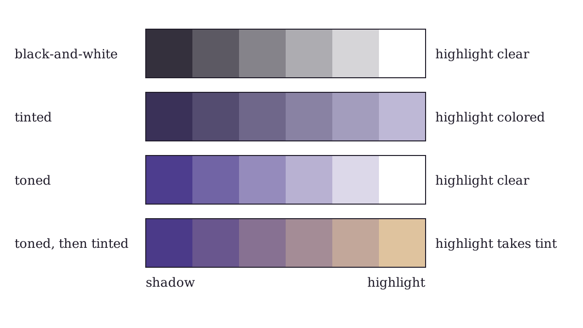
Schematic, not measured color: the same six gray steps untreated, under a tint, as a tone, and toned then tinted.
"Tinting and toning on one gray scale, schematic" by Flickers & Tintypes, https://flickersandtintypes.com/early-cinema/tinting-and-toning/ — CC BY 4.0, https://creativecommons.org/licenses/by/4.0/
A positive print holds its picture as a black-and-white silver image in a layer of gelatin, the clear jelly that coats the film. Where the silver is thick, the screen shows shadow. Where there is none, Kodak says the highlights consist “of plain gelatine.”
Tinting puts dye into that gelatin, so the color lies over shadows and highlights alike. Toning works on the silver instead. Kodak names the colored compounds it relied on: iron ferrocyanide is blue, copper ferrocyanide is red, and uranium ferrocyanide is reddish brown. Part II of the handbook sums up the result: “while the highlights are clear, the shadows are colored.”
| Tinting | Toning | |
|---|---|---|
| What takes the color | the gelatin, dyed all over | the silver image, wholly or partly replaced |
| Highlights | colored | clear |
| Shadows | dark, under the same color | colored |
| Coloring material | acid dyes, from six standard Cine dyes | metal compounds, silver sulphide, or a dye held by a copper tone |
| Kodak’s 1918 samples | 12 tints, numbered 1 to 12 | 14 tones, lettered A to N |
| Kodak’s caution | strong tints only for special cases such as fire, sunset and moonlight | judge a tone on the screen, not in the hand |
A tint also costs the picture some punch. Kodak says only “good snappy positive film” could be tinted well, “since tinting tends to reduce contrast.”
Kodak adds one overlap. A delicate tint warms the black silver too, and tint No. 11 “gives the effect of a blue-black tone.” So the test is where the color sits on the strip. Look at the highlights.
To tell the two apart on a frame, the handbook’s definitions give three things to check:
- Find the brightest part of the frame, such as a sky, a white dress or a lamp. If it carries color, that points to a tint, perhaps over a tone.
- Look at the shadows. If they carry a color while the bright parts stay clear, that points to a tone.
- If the bright parts carry one color and the shadows another, it may be both: toned first, then tinted.
Each check only reads the strip you are holding or the scan you are viewing. Fading, a later copy or a restoration can change the answer, as the last section of this page explains.
Kodak’s 1918 list: 12 tints and 14 tones
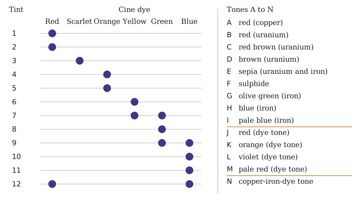
Kodak 1918 tints 1 to 12 by dye, and tones A to N by Kodak’s names; amounts, times and temperatures left out.
"Kodak 1918 tints 1 to 12 by Cine dye, and tones A to N" by Flickers & Tintypes, https://flickersandtintypes.com/early-cinema/tinting-and-toning/ — CC BY 4.0, https://creativecommons.org/licenses/by/4.0/
Kodak built all twelve sample tints from six standard dyes: Cine Red, Cine Scarlet, Cine Orange, Cine Yellow, Cine Green and Cine Blue. The preface says the sample tints were “curtailed to twelve,” and the handbook calls its formulas “merely for guidance.” By this site’s count, nine of the twelve use a single dye. Tints 7, 9 and 12 mix two.
The preface explains why the dyes had changed. Foreign dyes had become hard to get, so this edition switched to American dyes from the National Aniline & Chemical Company. Blue was the weak spot: Kodak admitted it had no “thoroughly satisfactory blue dye,” because film tinted with Cine Blue came out “too red.”
| Cine dye or dyes | Tint numbers |
|---|---|
| Red | 1, 2 |
| Scarlet | 3 |
| Orange | 4, 5 |
| Yellow | 6 |
| Yellow and Green | 7 |
| Green | 8 |
| Green and Blue | 9 |
| Blue | 10, 11 |
| Blue and Red | 12 |
Kodak kept strong tints for exceptions. It calls them “very undesirable” except in special cases “such as fire scenes, sunset and moonlight effects, and the like.” For general use it recommends delicate tints “ranging through pink, rose, orange, yellow, pale green and pale blue.” It also warns that any tint with Cine Blue looks much redder by lamp light than by daylight.
The tones run from A to N. By this site’s reading of the formulas, the first nine use metal compounds or sulphide. The last five sit under the book’s heading New Tones and use dye toning, where a copper tone holds a dye on the image “while the highlights consisting of clear gelatine remain colorless.”
| Tone | Kodak’s name | Colored by |
|---|---|---|
| A | Red (Copper) | copper ferrocyanide |
| B, C, D | Red, Red Brown, Brown (Uranium) | uranium ferrocyanide, from one bath |
| E | Sepia (Uranium and Iron) | the red and blue toning baths mixed |
| F | Sulphide | silver sulphide: warm brown on thin film, blue-black on denser film |
| G | Olive Green (Iron) | an iron toning bath |
| H, “I” | Blue, Pale Blue (Iron) | iron ferrocyanide |
| J, K, L | Red, Orange, Violet (Dye Tone) | Safranine A, Chrysoidin or Methyl Violet, held by a copper tone |
| M | Pale Red (Dye Tone) | the J and K dyes mixed, held by a copper tone |
| N | Copper-Iron-Dye Tone | copper and blue iron tones, with the Chrysoidin dye held by the copper |
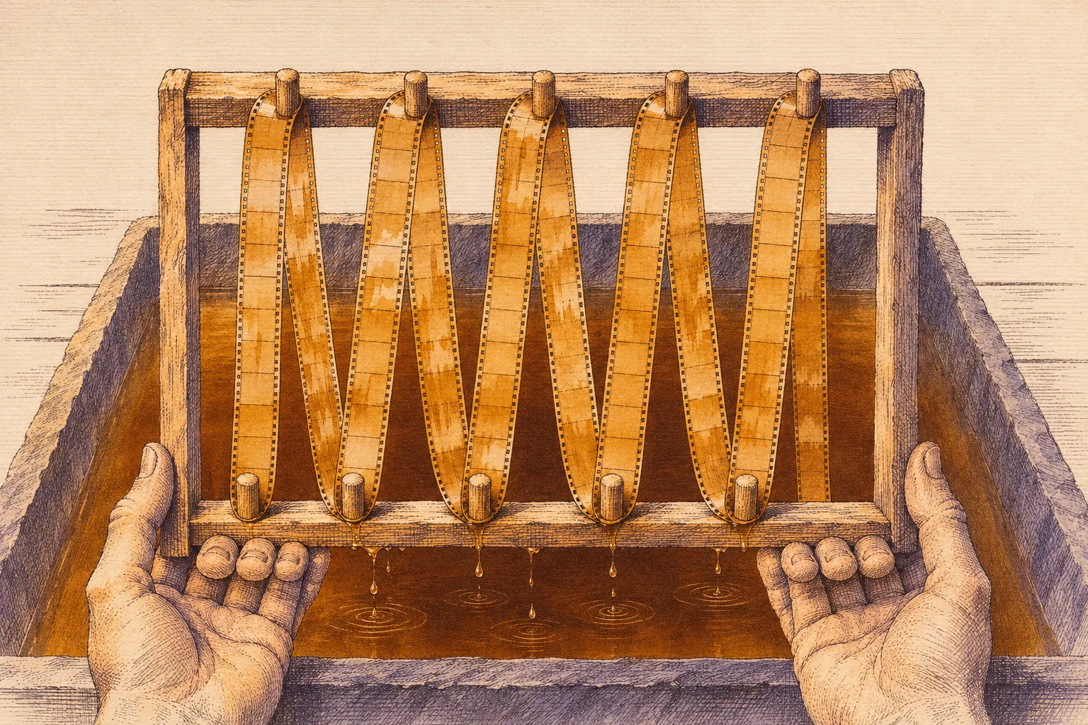
Whole lengths of film were worked in tanks, on racks or small drums, kept apart from developing. Kodak wanted tanks of slate or other resistive material and racks of wood, because a metal peg or pin “will gather the tone in preference to the film.”
 Illustration
Tinting and toning were done on whole lengths of film, in tanks on racks or small drums.
Illustration: Flickers & Tintypes. Generated schematic image — not a photograph, film frame or historical record. No copyright is claimed in this generated imagery; you may reuse it, and a credit to Flickers & Tintypes is appreciated.
Download the Kodak 1918 tints and tones table (CSV) source and license notes
Toned, then tinted: moonlight on water
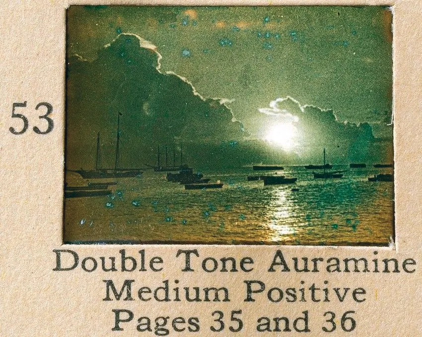
Sample 53, Double Tone Auramine, Medium Positive, on a later Kodak sample page headed Double Tones on Eastman Nitrate Base Film.
“Sample 53, Double Tone Auramine, Medium Positive, from a Kodak sample page headed Double Tones on Eastman Nitrate Base Film” — Eastman Kodak Company — public domain full credit
"Sample 53, Double Tone Auramine, Medium Positive, from a Kodak sample page headed Double Tones on Eastman Nitrate Base Film" by Eastman Kodak Company — https://commons.wikimedia.org/wiki/File:Double_tones_on_nitrate_base.jpg — Public domain: Public domain in the US (presumed published 1927, the date given by the uploader on the Commons file page and not checked against the book; before 1931) and in the EU (corporate work by Eastman Kodak Company with no natural author named; presumed published 1927, 70 years from publication expired in 1997); photograph of a flat printed page with mounted film samples; modified: cropped to sample 53 with its number and printed label
The two methods could share one strip. Kodak writes that a tint laid over a tone makes the highlights “assume the color of the dye,” while the shadows show a blend of dye and tone. It names one use above the others: “The most successful combination of toning with tinting is in the production of sunset and moonlight effects over water, by first toning blue and then tinting orange, red or yellow.”
The 1918 Tinted and Toned sheet carries that pairing. Tone H, the blue iron tone, appears there with Tints 2, 6 and 8. Tint 2 is made with Cine Red and Tint 6 with Cine Yellow, the red and yellow of Kodak’s advice. Tone N goes a step further: Kodak calls it a double tone, “the shadows appearing dark blue and the half-tones reddish brown.”
The page above uses the same words, double tones, on a later sample page. Its Commons file page dates it to 1927, from the uploader’s entry. Sample 53 shows a harbor with a bright disk low in the sky, and its light runs across the water. The text it points to, pages 35 and 36, is not in the photograph, so this page does not say how sample 53 was made.
The heading names the film base: nitrate. A reel that might be nitrate belongs with a film archive, not on a projector, in a dye bath or on a scanner at home, as Held to the light notes.
What the color on a surviving copy can prove
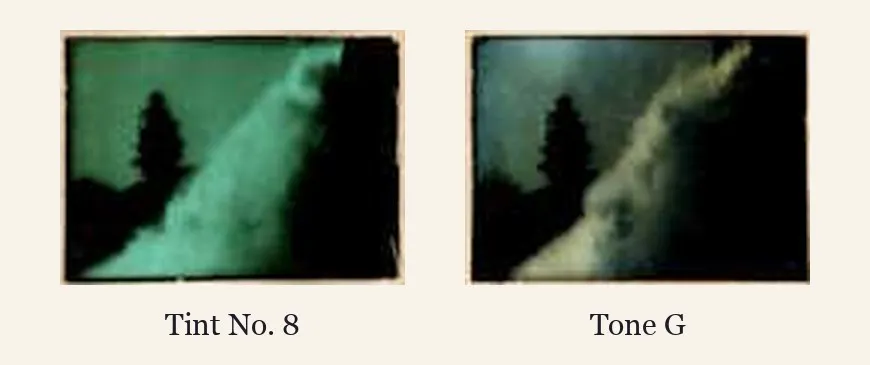
Tint No. 8 and Tone G, Kodak 1918, backs of the Tints and Tones sheets as scanned, enlarged three times: what appears to be one scene.
“Tint No. 8 and Tone G side by side, from the backs of the Tints and Tones sheets, Kodak 1918” — Eastman Kodak Company — public domain full credit
"Tint No. 8 and Tone G side by side, from the backs of the Tints and Tones sheets, Kodak 1918" by Eastman Kodak Company — https://www.gutenberg.org/ebooks/70417 — Public domain: Public domain in the US (published 1918) and in the EU (corporate work by Eastman Kodak Company, no natural author named; published 1918, 70 years from publication expired in 1988); the side-by-side arrangement and labels are this site's; modified: two samples cropped from two page images (back of Tints, back of Tones), each enlarged three times, placed side by side on a plain ground with printed labels
Seen side by side, the two samples make the point from the opening. Tint No. 8 is green even in its brightest band. Tone G keeps that band pale, with color only in the darker parts. These are century-old samples in a 502-pixel scan.
So their color now shows what this copy of the book looks like, not the color of 1918.
Kodak itself warned about judging by eye. Some toned film, it wrote, looks “colored in the hand” but gives “a substantially black and white image on projection.” It also wrote that toning “is inadvisable” for film that has to be stored for long periods. A pale tone on an old print may be what is left, not what was made.
The same limit applies to any silent film you watch today: the color is the color in this copy. A restoration may have tinted a film again from records or from a guess. So a page here speaks of the original color only when a collection record or a study of the versions supports it.
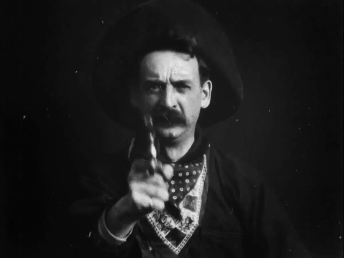
Machine colorization goes further and paints a predicted color over the evidence in the copy. Frames from The Great Train Robbery on this site come from one named copy, and nothing in them is claimed for the film as a whole.
The word tint has an older meaning on photographs. In an 1872 manual on the ferrotype, the tintype, Edward M. Estabrooke wrote that ordinarily “only the cheeks and lips are tinted,” with dry color on a soft brush. That is color by hand, closer to hand-colored photographs and to what Kodak called local tinting, applied “by hand with a brush, or by stencilling” (p. 29).
Prints consulted
- 1Eastman Kodak Company, Tinting and Toning of Eastman Positive Motion Picture Film, second edition, revised. Rochester, N. Y.: Eastman Kodak Company, 1918. https://www.gutenberg.org/ebooks/70417Read: full text and the three sample sheets, both sides; quoted passages checked against the page images
- 2Eastman Kodak, sample page Double Tones on Eastman Nitrate Base Film, dated 1927 on the file page; photograph on Wikimedia Commons, File:Double_tones_on_nitrate_base.jpg. https://commons.wikimedia.org/wiki/File:Double_tones_on_nitrate_base.jpgRead: file page and original image
- 3Edward M. Estabrooke, The Ferrotype, and How to Make It. Cincinnati and Louisville: Gatchel & Hyatt, 1872. https://archive.org/details/ferrotypehowtoma00esta_1Read: pages 20–21, 31–35, 53, 60, 72–75, 82–83, 97, 159–160 and 197, checked against the page images

Next reel:
- The Great Train Robbery: one identified copy, timed to the half second, and what its frames can and cannot say about the film.
- A Trip to the Moon: a film read through its maker’s 1903 catalog, because no copy of it qualifies.
- Public-domain original to view: Tinting and Toning of Eastman Positive Motion Picture Film, 1918 (Project Gutenberg)
Cite this page
Flickers & Tintypes. “Tinting and Toning: A Tone Alone Leaves the Highlights Clear.” Flickers & Tintypes. Published November 12, 2026. https://flickersandtintypes.com/early-cinema/tinting-and-toning/. Accessed [the date you read it].
Same sectionAlso in Early Cinema
 Illustration
Early Cinema
A Trip to the Moon: Méliès’s 1903 Catalog Lists 30 Scenes
Per the Star Films catalog dated 1903, A Trip to the Moon ran about 845 feet in 30 listed scenes for $130. Scene 9 reads “Landed Right in the Eye!!!”
Picture credit
Illustration: Flickers & Tintypes. Generated schematic image — not a photograph, film frame or historical record. No copyright is claimed in this generated imagery; you may reuse it, and a credit to Flickers & Tintypes is appreciated.
Early Cinema
The Great Train Robbery (1903): Edison’s Movable Close-Up
Edison’s 1903 catalog let the operator put the bandit’s close-up at the start or the end. One public-domain copy, walked scene by scene with timecodes.
Picture credit
"Frame at 13:14.5 of this copy, from The Great Train Robbery (1903)" by Edison Manufacturing Company — https://commons.wikimedia.org/wiki/File:The_Great_Train_Robbery_(1903).webm — Public domain: Public domain in the US (published 1903; Edison catalog of 1903 marked Copyright 1903) and in the EU (director Edwin S. Porter died 1941, per the Commons creator record; no later-dying author identified); copy: Library of Congress 00694220, record not consulted directly; WebM conversion by the Commons uploader; modified: single frame extracted and scaled to 1200 px wide
Early Cinema
Gertie the Dinosaur: A 1914 Trade Notice Says ‘Dinosaurus’
Per Moving Picture World of November 14, 1914, Winsor McCay’s hand-drawn Gertie was to be marketed as “the Dinosaurus” and reportedly got $350 for a week.
Picture credit
"Gertie the dinosaur standing on a cliff edge looking at a mastodon (Library of Congress LCCN 2002706759)" by Winsor McCay — https://commons.wikimedia.org/wiki/File:Gertie_the_dinosaur_standing_on_a_cliff_edge_looking_at_a_mastodon_LCCN2002706759.jpg — Public domain: Public domain in the US and in the EU (Winsor McCay died in 1934, per the Commons category data; life plus 70 years ended in 2004, which covers the drawing whether or not it counts as published); the Commons file page marks it public domain (Library of Congress record not consulted directly)